
Motion Curve
Motion is a central element for capturing our core promise of LIFETIME EXCELLENCE. By applying these specific motion curves, we translate our forward-looking visual elements, like the vertical movement of the Uplifting Line, into reliable, dynamic sequences. This precise system ensures that our identity appears consistently strong, forward-thinking, and focused on growth across all digital and film applications.
CSS definition for web applications:
cubic-bezier (0.2, 0, 0.8, 1)
Definition for motion design in Adobe After Effects:
Outgoing Velocity: 20%
Incoming Velocity: 80%
Motion principles
The motion principles define the character of our brand's movement. They ensure a consistent visual system and translate our core values, Leading, Straightforward, and Passionate, into a dynamic, purposeful language. This foundation provides our brand's movement with the necessary clarity, strength, and technical precision.
Vertical movement
Elements generally build from bottom to top.
They are animated exclusively in a vertical direction.
Speed and timing
Movements are fast, immediate and precisely aligned with the motion curve.
Scaling
Scaling is applied from the bottom anchor point (build-up) or from the top anchor point (break-down).
Opacity
Opacity should be used strictly for text and boxes. (Not for Uplifting Line and Pattern).
Pattern movement
Pattern builds upward in progressive steps and disassembles upward in the same order.
Motion principles don'ts
Movements that feel playful, overly decorative, or unclear go against the core of our motion principles. Avoid animations that lack direction, appear too soft, or introduce unnecessary complexity – they weaken the brand’s clarity, strength, and sense of purpose.
No horizontal movement
The direction of motion is always upward.
Unclear combinations of movements
Too fast or slow sequences with inconsistent timing appear unstructured.
Special effects
Applying additional effects to the motion.
No motion blur
No motion blur of movements.
No linear timing/curve
Without easing, movements appear unnatural, abrupt & static.
Rotation
No rotations – looks too playful and distracts from the essentials.
Uplifting line
The Uplifting Line is the key graphic element of motion branding. It visually translates the core function of PALFINGER products into a dynamic graphic form. While its placement may vary, there must always be sufficient margin to prevent unintended cropping depending of the context and application.
Type with Uplifting Line
Type with Uplifting Pattern
Uplifting line don'ts
The Uplifting Line is a distinct brand element of motion branding and must always appear consistent and purposeful. Misuse weakens its clarity and impact. The following rules outline what to avoid so that the Uplifting Line retains its strength, recognizability and alignment with the PALFINGER brand.
No horizontal movement
The Uplifting Line must remain static in width and position. Never animate it horizontally.
No step variations
The Uplifting Line always consists of two or three steps. Never fewer or more.
No other colors
The Uplifting Line may appear only in the defined brand colors, excluding yellow.
No effects
Never apply modifications, effects, or stylistic changes to the Uplifting Line.
No other directions
The Uplifting Line always builds from bottom to top. Never from the side or top down.
Logo animation
The logo animation must always be used in the defined version provided in the brand toolkit. The animation must not be altered, shortened, extended, or combined with additional effects.
Size
To ensure consistent proportions, the logo size (height) is set to 1/8 of the format’s short side. For example, in a 1920 x 1080 px format, the logo height equals 135 px.
Logo outro
The outro animation serves as the closing element of branded video content and ensures a consistent brand presence. The defined logo outro asset must always be used as provided. It may not be shortened, altered, or combined with additional effects.
PALFINGER Logo
Following the logo animation, the yellow background seamlessly transitions to full screen and the video closes with the PALFINGER wordmark on a black background.
Logo outro with claim at end
The outro animation serves as the closing element of branded video content and ensures a consistent brand presence. The defined logo outro asset must always be used as provided. It may not be shortened, altered, or combined with additional effects.
Claim
The brand claim may be used as the closing message of the outro when it meaningfully reinforces products, services, vision, and trust. Its application in motion branding follows the same rules defined in the brand claim guidelines: It must be focused, deliberate, and placed in a high-value context.
Do
Use the brand claim in high-value content such as product launch films, service demonstrations or corporate vision videos.
Don’t
Do not use the brand claim in
short-lived or entertainment-driven content such as social clips, internal HR-related videos or event highlights.
Logo outro with claim at start
This alternative version, where the claim comes first, is not part of the standard package. It can be provided upon request and should only be used in exceptional cases.
Safe area and overlay

Overlay
For applications such as subtitles, lower thirds and text inserts, a black or white gradient overlay may be used to improve readability and is recommended where legibility is at risk. Use a black gradient on dark footage and a white gradient on bright footage. The overlay can be placed either at the top or bottom of the frame, with a height of 1/2 or 1/3 of the format.
Safe Area
The safe area is device and format dependent and should be defined individually. A minimum of 5% of the long side of the format must be reserved as a safe area. Depending on the application, additional space may be required for UI overlays.
Corner Bug
The logo size should occupy between 15% - 20% of the format’s short side and be positioned either in the top-left or the top-right corner.
Lower thirds
Lower thirds are used to display additional information such as names, titles, or short descriptions. They are placed at the lower edge of the frame, ensuring sufficient safe area for readability. Background overlays may be applied when necessary to maintain contrast and legibility.
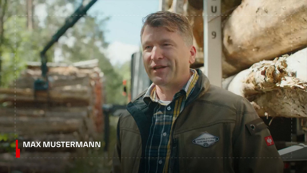
Single-line
In the single-line version, the name is aligned with the upper half of the Uplifting Line.
Two-lines
In the two-line version, both the name and job title are aligned with the Uplifting Line.
Three-lines
In the three-line version, the text from the second line onward must be aligned with the top edge of the lower Uplifting Line.
Template
Motion graphics templates are available to ensure consistent implementation. Please use it as provided without modifications or additional design elements.
Text insert (1)
Text inserts are used to highlight short pieces of information or key messages within video content. They must follow the defined typography, colors, and motion principles to ensure consistency with the PALFINGER brand. Placement should always respect the safe areas and overlays may be applied where necessary to maintain readability. Text inserts are concise, direct and free of decorative effects to keep focus on the message. Background overlays as needed for contrast/legibility.
Template
Motion graphics templates are available to ensure consistent implementation. Please use it as provided without modifications or additional design elements.
-asset-1-thumbnail)
Text insert (2)
Textbox
The textbox appears in Limestone at 65% opacity to ensure text remains legible on any background. This guarantees readability and consistency across all video applications.
Template
Motion graphics templates are available to ensure consistent implementation. Please use it as provided without modifications or additional design elements.
-asset-1-thumbnail-1)
Subtitles
Positioning and Typography
Subtitles are horizontally centered at the bottom or top of the frame within the safe zone. For optimal readability, the defined brand font is used. White typography is placed on a black background at 70% opacity.
Text Structure and Duratio
Subtitles should ideally consist of a complete sentence or two short phrases, spread across a maximum of two lines (three lines only if short and well-spaced). Line breaks must not split linguistic units, and the display duration of each subtitle should always match the reading speed.
Specifications
- 16:9 format: Font size 28-38 px; 1-2 lines per screen (max. 3 if short and well-spaced).
- 9:16 format: Font size 30-40 px; 2 lines per screen (max. 3 if needed).
Colors
- Black background with white typography
- Limestone background with black typography
Examples
The following examples show how motion branding elements are applied consistently across all formats and contexts. They showcase the correct use of typography, colors, overlays, and the Uplifting Line to ensure a strong and recognizable brand presence in motion. Each example serves as a reference for best practices, helping translate the brand identity into moving images with clarity and impact.